Nature's Truth
Client: Trinidad Benham | Agency: Anthem Branding | Conceptual Art
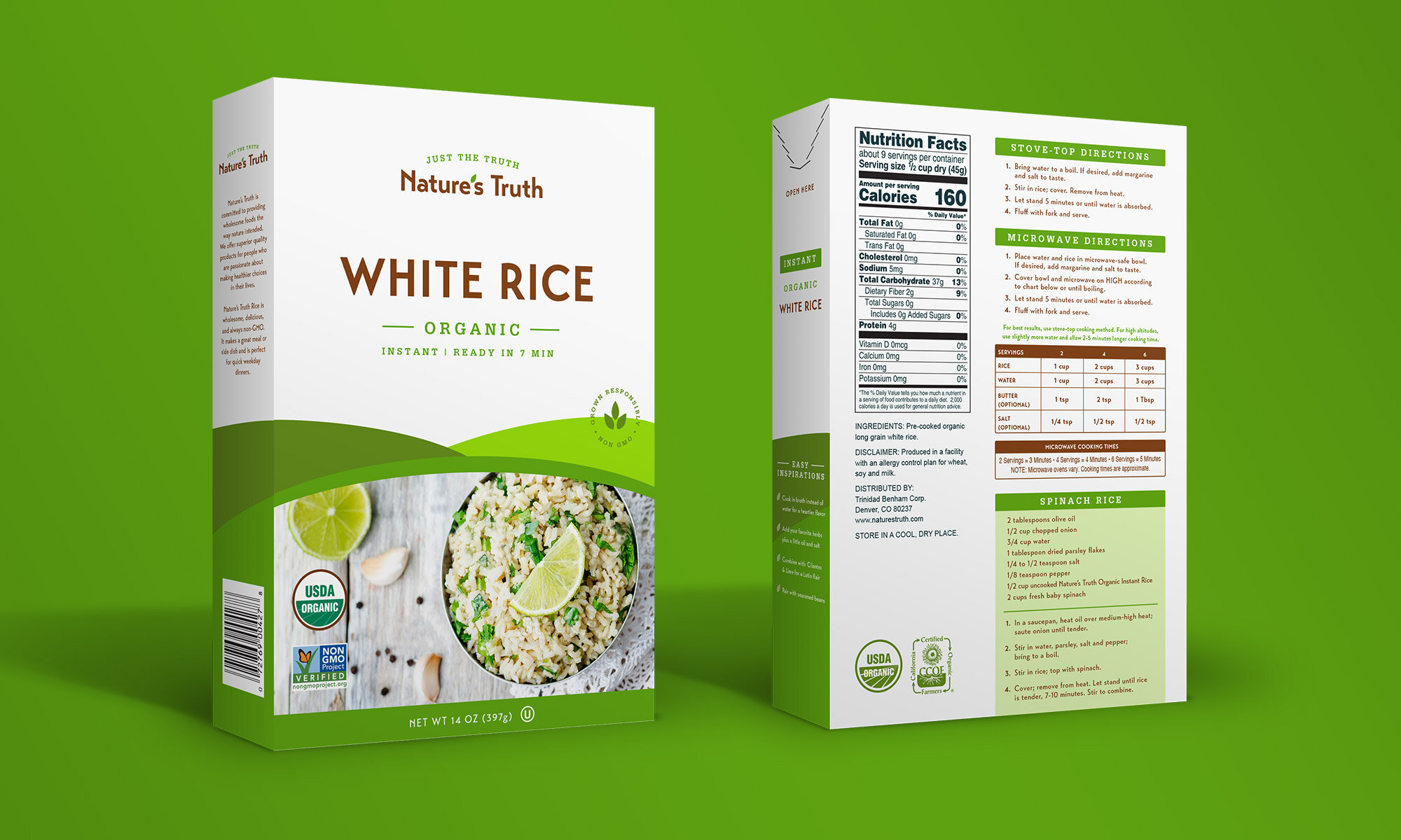
Trinidad Benham came to Anthem Branding looking for a logo and packaging refresh for their new product line, Nature’s Truth. Our goal was to create a clean, compelling packaging system for Nature’s Truth that could be carried across all products, flavors, and sizes for a cohesive look.


Packaging Detail
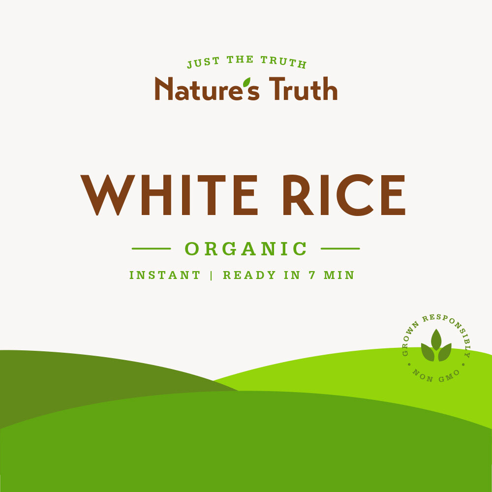
Pairing a slab serif font with clean typography created a wholesome and organic design. Incorporating a crest added a premium and trustworthy element to the layout.
Before & After
Anthem Branding’s goal was to evolve the existing design to feel more premium, organic, and trustworthy. The fresh, updated logo is legible, clean and incorporates elements of the original; the leaf apostrophe is modernized, the swoosh is reimagined as an arched tagline. The rolling hills that represent the sustainable elements of the brand were simplified to feel more premium. Colors remained the same for a smooth, recognizable transition.


Vision
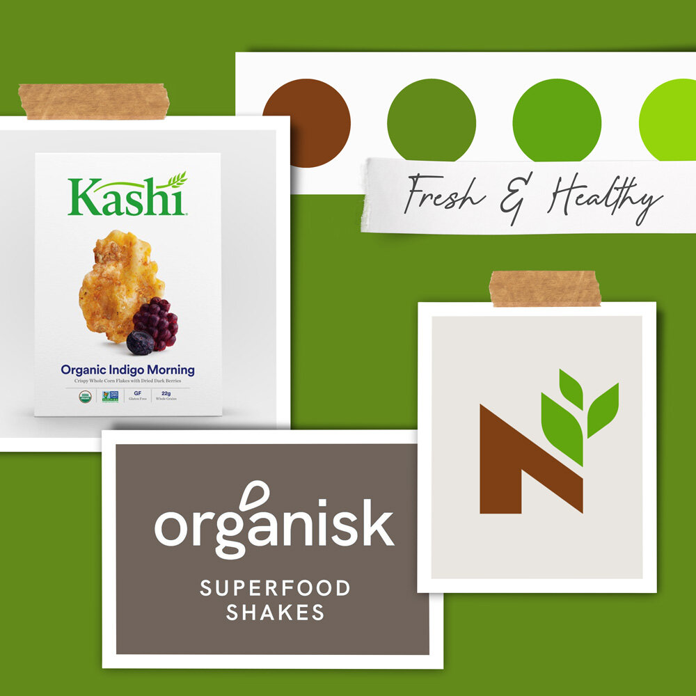
With this visual direction, we looked for subtle ways to modernize the existing packaging design and logo. A clean and open design featuring maximum white space felt premium and trustworthy, while earthy colors spoke to the wholesome nature of the brand. Incorporating a leaf icon nodded to the healthy and sustainable aspects of the brand.
Packaging System
The full system keeps a consistent design - with the layout and hierarchy staying the same. The colors of the rolling hills change to signify whether the product is organic or non-organic.

